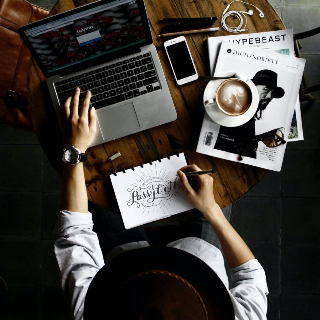
Welcome to the world of visual aesthetics, where the role of typography in UI design takes center stage. Typography is not just about choosing beautiful fonts; it’s a crucial element that bridges the gap between user interface functionality and user experience.
As we delve into the intricate relationship between type and design, we’ll explore how the artful selection of typefaces, font weights, and text layouts can profoundly impact the usability and appeal of digital products. Join us as we unpack the significance of typography in crafting interfaces that are not only visually compelling but also enhance the overall user journey.
Understanding typography and its impact on user interface design

Typography serves as the silent ambassador of design, subtly shaping the user’s experience as they navigate a user interface. Its role in UI design is paramount, dictating the clarity, accessibility, and even the emotional response to the content presented.
When typography is well-executed, it can elevate the user’s journey, guiding them through the interface with elegance and purpose. The choice of font, size, weight, and color are not merely aesthetic decisions; they are functional elements that contribute significantly to user engagement and hierarchy of information. For instance, consider the delicate art of selecting a typeface.
A sans-serif font, with its clean and modern appearance, communicates a different message and feeling compared to a serif font which may evoke tradition and reliability. Moreover, the weight of a font can emphasize the importance of a call-to-action button or minimize distraction around secondary information. A clever hierarchy crafted through type variations leads users intuitively to the most vital pieces of content, enhancing the UI’s usability.
Examples of typography’s impact can be found in some of the most successful digital platforms. Take, for example, a reading app that uses a serif font to mimic the look and feel of printed literature, thereby creating a cozy, familiar reading experience for users.
Contrast that with a high-energy sports app that utilizes bold, sans-serif lettering to convey excitement and movement, directly appealing to the user’s sense of action and immediacy. Both choices in typography are intentional, catering to the specific needs and emotions of the target audience, showcasing just how crucial type is in crafting a user interface that is not only visually appealing but also deeply resonant with its users.
In conclusion, typography is far from a mere flourish in the realm of UI design; it is a cornerstone of effective communication and user experience. By understanding and harnessing its power, designers can create interfaces that speak to the user in more ways than one, forging powerful connections and ensuring a smooth, pleasant digital interaction.
The psychology of typography in ui design: how fonts influence user perception

The Psychology of Typography in UI Design: How Fonts Influence User PerceptionThe often-unheralded hero of UI design is, without a doubt, typography. While many may consider typography to be simply the art of arranging letters and text in a readable and aesthetically pleasing way, it is, in fact, a potent psychological tool that subtly influences user perception and behavior. Every font carries its own emotional baggage and narrative power, playing a crucial role in crafting the user’s experience and the overall impression of the digital landscape.
Imagine browsing through an app where the font choice is a serious, stiff Times New Roman. It may inadvertently set a tone of formality and tradition, which could be perfect for a legal or a scholarly platform; however, if that same typeface were used for a youthful social media app, it would likely conflict with the expected personality and might even dissuade younger users from engaging with the platform.
On the flip side, a casual, handwritten font like Comic Sans, when used in a financial app intended to convey security and professionalism, could undermine trust in an instant. Herein lies the magic of typography in UI design – the silent yet striking way it communicates brand identity and usability.
Moreover, typography’s influence stretches beyond first impressions – it extends to how efficiently users absorb information. For example, a well-chosen font for a user interface will significantly impact scanability, legibility, and user fatigue. As users skim through content, typeface traits such as x-height, character spacing, and line length all subtly guide the reader’s eye in a rhythmic dance of cognition.
Sans-serif fonts like Helvetica are often celebrated for their clean simplicity and legibility on screens, promoting a feeling of modernism and neutrality, thereby easing the user’s journey through menus, instructions, and actions. In contrast, a poorly chosen font can cause users to stumble, squint and eventually abandon their quest with frustration.
In conclusion, the role of typography in UI design is a narrative element as vital as the color palette or the layout. It’s the quiet conductor of an interface’s symphony, directing user emotions and interactions with every curve and line. Fonts are not merely vessels for words, but rather the essence that breathes life into the story of the interface.
So next time you marvel at the clarity and feel of an app, remember the unspoken eloquence of typography: a font is not just a design detail but a psychological imprint that shapes our digital experiences.
Best practices for selecting and implementing typography in ui design

### Best Practices for Selecting and Implementing Typography in UI DesignThe prowess of typography in UI design cannot be overstated. It’s the silent ambassador of your brand, the unseen hand that guides users through the maze of your user interface, and the subtle whisperer of tone and intent.
In the realms of user experience, typography does not merely serve to present information; it shapes the character of your application and affects the usability and emotional impact of a design. As digital craftsmen, understanding how to harness the power of type is crucial, and implementing typography with deft precision is a skill that sets master designers apart from their peers. Selecting the right typeface is a delicate dance between form and function; it’s where art meets science in UI design.
The first consideration should always be readability. After all, what use is a beautiful font if users have to squint or, worse, abandon ship because they cannot decode your digital hieroglyphics?
For body text, sticking to tried-and-tested sans-serif fonts like Helvetica or Roboto often reigns supreme, offering a clear, no-nonsense approach to legibility. For headers and accents, here’s where your creative flair can shine — serif fonts like Playfair Display or slab serifs like Rockwell add character and hierarchy but choose wisely to ensure harmony and coherence within your design scheme. But there’s more to typography than choosing a few stylish fonts.
Like a master chef uses seasoning to enhance a dish, typography in UI design requires the meticulous adjustment of letter spacing (tracking), the space between lines of text (leading), and the artful use of font-weight to guide user attention and allow for a scannable and comfortable reading experience. Take, for instance, a simple call-to-action button: a bold sans-serif, tightly tracked, commands attention and clicks. Or consider the nuanced elegance of a landing page headline with perfectly set leading; it welcomes you into the narrative, creating a clear focal point without saying a word.
By implementing these practices, typography transcends being merely a vessel for content delivery; it becomes the director of user focus and flow, elevating the entire interface from functional to phenomenal.
The interplay between typography and other ui design elements
Understanding the interplay between typography and other UI design elements reveals much about the role of typography in UI design. At its core, typography is the art and technique of arranging type to make written legible, readable, and visually appealing.
In the realm of user interface (UI) design, typography does not merely serve as text on a screen; it is a pivotal element that can heavily influence user experience and interactions. Typography in UI design serves several critical functions. First and foremost, it facilitates communication.
The right choice of font, font size, and text arrangement can significantly enhance the clarity of the message and help with the content hierarchy within the interface. Take, for example, the difference between a clean, sans-serif font like Helvetica used in a mobile app interface and a more decorative, seriffed font such as Times New Roman. The former often gives a more modern and approachable feel, which is why it’s a favorite in minimalist app designs, where the user’s attention needs to be focused on functionality and ease of navigation.
The latter, while elegant and traditional, can make the interface appear cluttered if not used sparingly, potentially harming usability. Furthermore, typography must harmonize with other design elements such as color, imagery, layout, and spacing to create a seamless and intuitive user experience.
The weight and color of the type, for example, can determine the visual focus of the UI, guiding users’ eyes to important actionable items like buttons and alerts. It’s not just about using bold fonts for emphasis; it’s also about knowing when and where to use them.
A carefully selected typeface in a complementary color can turn a call-to-action button into a beacon for the user, while poorly chosen combinations may lead to a user missing the button entirely. Navigating through the UI becomes intuitive when there is a structured typographical hierarchy – where different type sizes and styles denote the importance of various text elements. Consider the implications of a homepage with a massive, bolded header stating „Welcome to Our World” which immediately draws attention, followed by smaller subheadings and even smaller body text.
This descending scale not only looks aesthetically pleasing but also subconsciously instructs the user how to digest the content, following the flow that the designer intended. In this manner, typography works hand-in-glove with other elements to create a coherent narrative and path of interaction throughout the application or website. Through these examples, it becomes clear that the role of typography in UI design extends beyond mere aesthetics. It is a fundamental component that interacts closely with other elements to either elevate user experience or potentially detract from it. The interplay between these elements should not be underestimated, as mastering this balance is a hallmark of impactful UI design.
Future trends in typography for ui design: innovations and predictions
**Future Trends in Typography for UI Design: Innovations and Predictions**Typography in UI design serves as a silent ambassador of brand personality, playing an integral role in how users perceive and interact with digital experiences. It’s not just about selecting attractive fonts; it’s about setting the tone, enhancing usability, and ensuring accessibility. As we continue to navigate the digital age, the trends and innovations in typography for UI design are rapidly evolving, promising to reshape user interfaces in profound ways.
One upcoming trend is the emergence of variable fonts, which are a single font file that behaves like multiple fonts. This innovation allows for an immense flexibility in adjusting weight, width, and other attributes within a continuum of design space, without loading multiple font files.
This not just optimizes load times—a boon for the user experience—but unleashes creative potential for dynamic text animations and responsive design adjustments that contribute to a more personalized interface. Imagine a UI that adapts its typographic presentation to the time of day, the user’s mood inferred from their interaction patterns, or the ambient light conditions.
Another development is the increasing use of typography to enhance voice and tone differentiation in UI. As brands strive to stand out and resonate emotionally with users, the role of type in conveying mood becomes paramount. For example, a fintech application might employ a sturdy, sans-serif font to instill a sense of security and trustworthiness, while a wellness app might opt for a soft, serif typeface to exude warmth and comfort.
Coupled with advancements in color science and typography, UI designs are set to become more expressive and emotionally intelligent. Looking ahead, the prediction is that we’ll see a rise in bespoke typographic work, where designers eschew off-the-shelf fonts in favor of creating custom typefaces that are meticulously tailored to a brand’s identity and user experience goals.
This level of personalization not only solidifies brand identity but can improve readability and navigability for diverse user groups, promoting inclusivity in design. As UI designers harness these typographical trends and innovations, the expectation is not just for prettier interfaces, but smarter, more adaptive, and inclusive user experiences. Typography in UI design is poised to move beyond mere legibility, morphing into a powerful tool for storytelling, emotional connection, and ultimately, a seamless interaction between users and technology.
Nasza rekomendacja video
To sum up
In conclusion, typography plays a pivotal role in UI design, influencing readability, user experience, and the overall aesthetic appeal. Thoughtful selection and implementation of typefaces, font sizes, and spacing can significantly enhance the clarity and effectiveness of an interface, ultimately guiding users seamlessly through a digital product’s content and functions.
FAQ
How does typography impact the user experience in UI design?
Typography significantly impacts user experience in UI design by influencing readability, accessibility, and the overall aesthetic appeal of the interface. Well-chosen fonts and thoughtful typographic arrangements can guide users effortlessly through content, establish visual hierarchy, and convey the right mood and brand message, while poor typography can lead to confusion, strain, and a negative perception of the product.
What are the key principles of selecting the right typography for a user interface?
When selecting typography for a user interface, the key principles include ensuring readability and legibility, maintaining consistency with the UI’s overall style and tone, and considering the user experience by choosing fonts that are scalable across different devices and screen sizes. It’s also important to select typefaces that complement the content and functionality of the interface, and to use a limited number of font families to avoid visual clutter.
How can typography contribute to the overall branding and identity of a digital product?
Typography plays a crucial role in branding and identity for a digital product by establishing a distinct visual tone that communicates the brand’s values and personality. The choice of fonts, sizes, spacing, and hierarchy not only enhances readability and user experience but also helps create a memorable impression that can differentiate the product from competitors. Consistent use of typography across all touchpoints reinforces brand recognition and fosters trust with the audience.
In what ways does typography affect the readability and accessibility of a UI?
Typography significantly impacts the readability and accessibility of a UI by influencing how easily users can process information. The choice of font type, size, color, and spacing can either facilitate a clear and effortless reading experience or create strain and confusion. Poorly chosen typography can hinder users with visual impairments or dyslexia, while well-considered typography can enhance legibility and comprehension for a broad audience, ensuring that the UI is inclusive and user-friendly.
What are the current trends in typography within UI design, and how are they influencing user engagement?
Current trends in typography within UI design include the use of bold, sans-serif fonts for their readability and modern aesthetic, as well as variable fonts for their flexibility across different screen sizes and resolutions. These trends are enhancing user engagement by improving legibility, creating a more dynamic visual hierarchy, and providing a more responsive and personalized user experience. Additionally, the inclusion of inclusive and accessible type options ensures a wider audience can interact comfortably with the UI.
How do UI designers balance creative typography with functionality and user-friendliness?
UI designers balance creative typography with functionality and user-friendliness by adhering to readability and legibility principles while allowing for brand expression. They often choose fonts that are clear and easy to read across different devices and contexts, and use size, color, and spacing to ensure that the typography enhances the user experience rather than detracts from it. Additionally, they may employ creative typography sparingly for headings or specific UI elements to inject personality without compromising the overall usability of the product.

