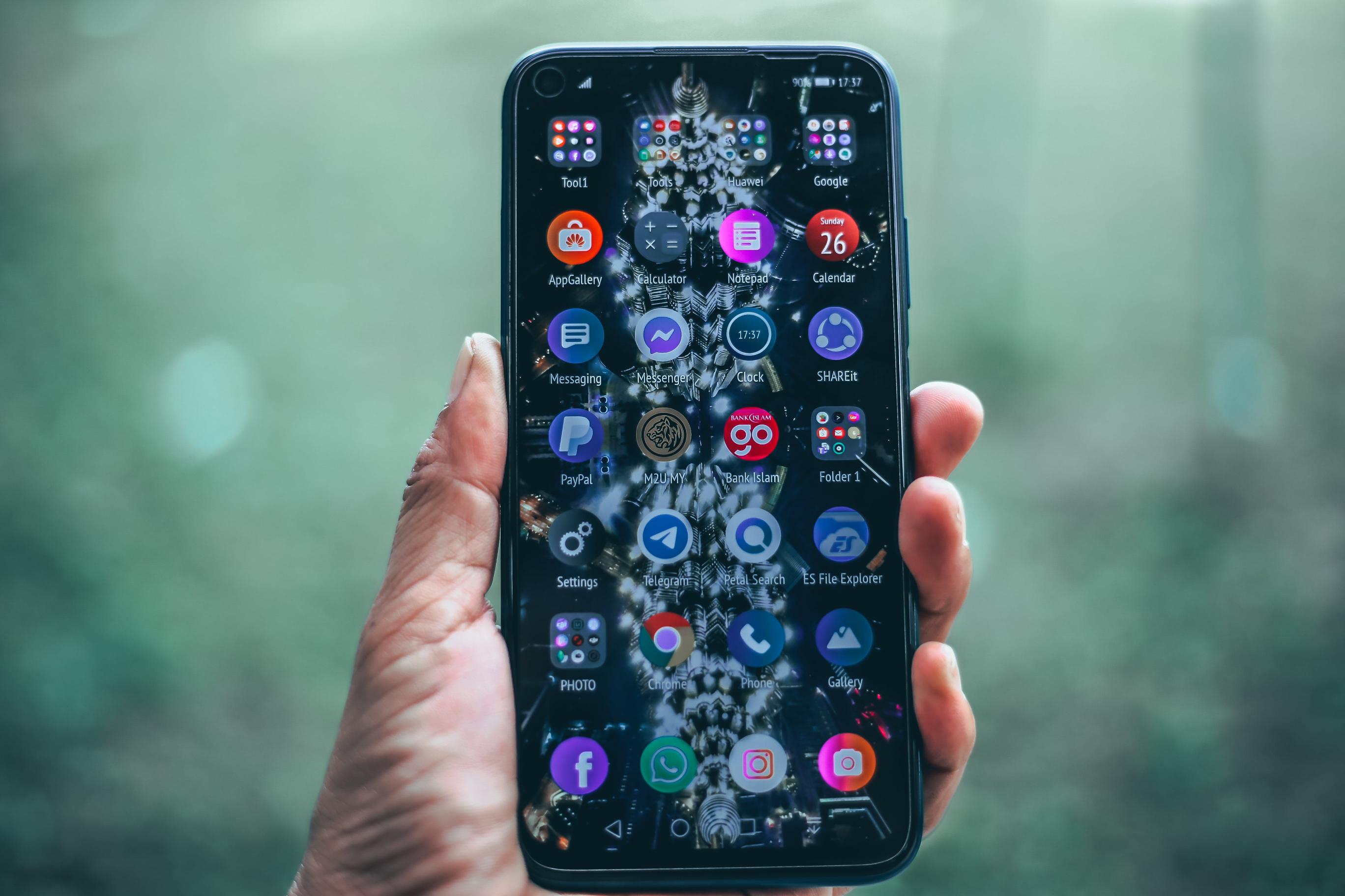
Welcome to the fascinating world of digital design, where every pixel plays a pivotal role in crafting user experiences. In this blog post, we delve into the harmonious relationship between iconography and UI design, exploring how these visual elements are not just mere embellishments but essential tools that guide users through a seamless interaction with technology.
Iconography, with its unique of symbols, works hand in hand with UI design to create intuitive and aesthetically pleasing interfaces. Join us as we unpack the significance of these design components and how they shape the way we interact with our digital devices every day.
The role of iconography in user interface design

Iconography plays a pivotal role in user interface design, serving as a visual shorthand that facilitates communication between the application and the user. These small, yet potent, graphical elements are the emissaries of meaning that bridge the cognitive gap, allowing for an intuitive interaction within digital environments. Icons condense complex actions into universally recognizable symbols, thereby enhancing usability and navigation.
A designer’s choice of iconography is a nod to both art and psychology, as the right icons can guide users fluidly through a labyrinth of content without a second thought. The efficiency of iconography in UI design is not only evident in the realm of aesthetics but also in its functionality.
Take, for example, the ubiquitous hamburger menu icon, composed of three stacked lines. It is a minimalist masterpiece that hides or reveals the navigation drawer on your device. Or consider the small yet mighty magnifying glass, now synonymous with search functionality.
These icons are now so ingrained in our digital vocabulary that they surpass barriers, cultural nuances, and even educational levels. Their power lies in their familiarity.
We instinctively know that a trashcan icon represents deletion and a paper plane signifies sending. However, the utility of iconography goes beyond just recognition; it can also enhance design cohesion and brand identity. Employing a unique set of icons can become a fundamental aspect of a brand’s visual , contributing to its distinct identity in a competitive digital marketplace.
Think of social media platforms such as Twitter and its bird icon or Instagram with its camera icon; these are not just navigational aids but also cornerstones of their brand identity. Icons need to not only be evident in their meaning but also consistent in style to foster a sense of harmony across the interface.
By marrying simplicity with expressiveness, the clever use of icons within UI design doesn’t just illustrate function; it elevates the entire user experience to a realm of visual poetry where every tap and swipe is a stanza in a larger, interactive narrative.
Understanding the psychology behind icon usability

Understanding the Psychology Behind Icon UsabilityThe fusion of iconography and user interface (UI) design creates a silent yet powerful dialect for digital communication. In the intricate dance of design elements that make up the user experience, icons play the role of visual shorthand – compact, universal, and crucial to seamless user interactions. The psychology behind their usability lies in their ability to transcend barriers, offering an instant cognizable cue that accelerates recognition and functionality within any application’s ecosystem.
Icons are marvels of minimalism, yet their simplicity belies the complex psychological interplay they engage in with users. From the familiar magnifying glass denoting 'search,’ to the universally understood 'trash can’ symbol for deletion, these symbols capitalize on our brain’s rapid visual processing abilities.
By anchoring an icon to a common action or object, designers tap into the mind’s associative learning processes. The result? A mere glance at a floppy disk, despite its obsolescence in the physical realm, still triggers the mental concept of 'save’ across generations of digital natives and immigrants alike.
However, the potency of an icon is not merely measured by what it represents, but also by its context, legibility, and consistency. A warning symbol splashed in fiery red is bound to arrest attention and signify caution, whereas the same symbol in a muted blue might whisper of something less urgent, illustrating the psychological undercurrents color and contrast play in UI design.
Moreover, the power of familiarity cannot be overstressed; a novel icon might be intriguing but could risk non-recognition and hinder user experience if not intuitively aligned with its function. Thus, the artful blending of aesthetic appeal and cognitive clarity is what ultimately earmarks an icon as a triumph in the realm of UI design.
In summary, iconography in UI design is a fascinating choreography wherein cognitive psychology and visual artistry intersect. When the baton is passed with precision, the result is a fluid, intuitive user experience that feels as natural as a conversation with an old friend. Icons, in their universal tongue, thus become not just a design element, but a bridge fostering the effortless exchange of ideas across the digital divide.
The evolution of icons in digital interfaces

### The Evolution of Icons in Digital InterfacesThe art of iconography has long been a crucial component in the tapestry of UI design, evolving right alongside each paradigm shift in technology. In the neon glow of early computing days, icons were simplistic, pixelated images that heralded a new age of human-computer interaction, serving as visual shorthand for the commands they tucked under their modest, bitmapped wings.
Fast forward to today’s sleek and intuitive interfaces, icons have undergone a metamorphosis, morphing into sophisticated symbols that are as multilayered and dynamic as the applications they inhabit. In tracing the lineage of digital iconography, one must pay homage to the pioneering efforts of Xerox PARC and Apple. The Xerox Alto, a progenitor in graphical UIs, debuted in the 1970s with icons that resembled office analogues, aiming to harness a user’s existing physical-world knowledge to guide interaction with the digital environment.
This visual mimicry was later refined and popularized in the early Macintosh systems, which leaned on iconography to make the burgeoning personal computing space more approachable. These early icons were more than mere pictures; they were heralds of a new, friendlier, and more intuitive mode of engaging with machines.
Today, iconography in UI design is a feat of minimalism and semiotics, with designers distilling complex operations into simple, often universally recognizable, symbols. Gone are the days of overt skeuomorphism, where a notepad icon might have been adorned with a level of detail to mirror its real-world counterpart. Modern icons prefer the delicate balance of form and function, where beauty meets usability.
Take, for example, the hamburger menu – those three little lines that hold an entire navigation system within them, a nod to efficiency and space-saving. Or consider the magnifying glass, a universally acknowledged sign of search; it’s as omnipresent as the need for knowledge in the digital age. These icons are the lighthouses in the vast sea of digital information, guiding users to their desired destinations with grace and economy of detail.
The evolution of icons in digital interfaces tells the story of us, of our journey into the ever-expanding digital universe. As we continue to plunge into new tech frontiers, iconography will undoubtedly evolve, anticipating needs and crystallizing functions in ways we can only begin to imagine.
The pixels of the past laid the groundwork, and the streamlined symbols of today propel us toward tomorrow, with each icon not merely a design element but a signpost of technological progression.
Best practices for creating effective ui icons
## Best Practices for Creating Effective UI IconsIconography plays a critical role in UI design, acting as the visual shorthand that helps users navigate complex digital environments with ease. When executing icon design, there are best practices which, when adhered to, can elevate a user interface from functional to intuitive, reducing cognitive load and beautifying the digital landscape.
Firstly, clarity reigns supreme in the realm of UI icons. Each symbol must be immediately recognizable and convey a singular idea that doesn’t require decoding, akin to a visual haiku that captures its essence in the simplest form. For example, a magnifying glass has universally come to represent search functionality; its presence alone can guide users to locate a feature without wading through text.
This level of intuitive design demands that icons are distinguishable at a glance, a trait often achieved through the employment of familiar metaphors that resonate across diverse user demographics. Another indispensable practice is consistency, which is the thread that weaves individual icons into a cohesive tapestry. This manifests not only in stylistic harmony, where icons share a common visual —be it flat design, skeuomorphism, or line art—but also in a logical coherence inside the UI.
There’s a certain rhythm reached when all icons maintain a uniform scale, stroke width, and perspective, and this rhythm becomes the silent symphony that orchestrates user interactions. Consider, for instance, the suite of icons in a well-designed social media app, each differing in function but singing the same melodic line of the app’s design ethos.
Finally, scalability is a cornerstone of icon design that ensures functionality across a myriad of devices. With users accessing interfaces on everything from colossal desktop monitors to the smallest smartwatches, icons must be designed to maintain their legibility at any size.
This often means that icons should be as simple as possible, avoiding intricate details that disappear when scaled down. Graceful scalability is also about anticipating the context in which an icon is seen, so an envelope for an email app should be recognizable on the status bar of a smartphone just as clearly as when it’s on the dashboard of a web client. In sum, when icons are the visual cues guiding the user journey, they must be clear, consistent, and scalable—the silent annunciators of the UI world.
Thoughtful iconography can transform a digital interface from a cluttered maze to a sleek and navigable space, helping users find their way with delightful ease.
The future of iconography in ui design: trends and predictions
The Future of Iconography in UI Design: Trends and PredictionsIn the ever-evolving world of UI design, iconography remains an integral element, serving as the universal that bridges gaps between functionality and aesthetic, diverse cultures, and user experiences. Not only do icons bring visual relief to interfaces, but they also facilitate an intuitive navigation through the digital landscape, making complex actions appear simple and accessible. As we venture further into an era where the majority of our interactions are screen-based, the way we perceive and interact with icons is bound to undergo significant transformations.
Stepping into the near future, we can anticipate a surge in the demand for icons that not just complement the design but also adapt dynamically to diverse user contexts. The concept of responsive icons is not new but will likely gain more traction.
These chameleonic visuals have the ability to change their level of detail and complexity depending on the device’s resolution or user’s setting preferences. Picture an icon that simplifies itself when viewed on a smartwatch and reveals a more intricate design on a 4K desktop display—this level of adaptability speaks volumes of thoughtful design and consideration for the end user’s experience.
Moreover, with the integration of AI in design processes, predictive iconography could carve out a niche of its own. Imagine icons that anticipate your next action based on your behavior patterns and frequently used features, or icons that morph during different times of the day to reflect usage statistics. Such predictive icons would not only enhance the user experience but also personalize it to an unprecedented level.
Augmented reality (AR) and virtual reality (VR) will also make headway into UI design, paving the way for immersive iconography. Icons in AR and VR environments are expected to break free from the constraints of two-dimensions and involve users in a more interactive and engaging manner, positioning UX at the forefront of iconic evolution. As designers keep their fingers on the pulse of technological advancements, the narrative of icons is set to unfold in a riveting manner.
From responsive and predictive to immersive and interactive, the future of iconography in UI design holds boundless possibilities. As the glue that holds the visual interface together, icons will continue to be more than just tools for navigation, becoming an experience in and of themselves—an experience that is set to revolutionize the way we interact with our digital surroundings.
Nasza rekomendacja video
Summation
In conclusion, the integration of iconography in UI design is crucial for creating intuitive and engaging user interfaces. Icons serve as visual cues that guide users, enhance usability, and contribute to the aesthetic appeal of digital products.
By employing thoughtful and consistent iconography, designers can significantly improve user experience and facilitate seamless interaction with the application or website.
FAQ
How does iconography enhance user experience in UI design?
Iconography enhances user experience in UI design by providing intuitive visual cues that make navigation and comprehension faster and more efficient. Well-designed icons can communicate function and meaning at a glance, reducing cognitive load and making interfaces more accessible. Additionally, consistent use of icons can contribute to a product’s visual identity, creating a more memorable and enjoyable user experience.
What are the best practices for creating effective and intuitive icons for user interfaces?
Best practices for creating effective and intuitive icons for user interfaces include ensuring simplicity and clarity to avoid confusion, maintaining consistency in style and size across the icon set for visual coherence, and using familiar metaphors or symbols that are easily recognizable to users. Additionally, testing icons with a diverse user group can provide valuable feedback to refine their intuitiveness and effectiveness.
How has the evolution of screen resolutions and sizes influenced icon design in modern UIs?
The evolution of screen resolutions and sizes has significantly influenced icon design in modern UIs by necessitating icons that are scalable and clear across a variety of displays, from small mobile screens to large 4K monitors. Designers now often create vector-based icons that maintain sharpness at any resolution, and they focus on simplicity to ensure that icons are easily recognizable at a glance, accommodating the diverse range of devices and screen densities in the market. Additionally, the touch-screen interface of many modern devices requires icons to be sized appropriately for finger taps, influencing the design towards larger, more touch-friendly icons.
In what ways can iconography be used to reinforce brand identity within a user interface?
Iconography can reinforce brand identity within a user interface by providing consistent visual elements that reflect the brand’s aesthetic and values, creating a memorable and cohesive experience for users. Custom icons can incorporate brand colors, shapes, and motifs, making the interface intuitive and instantly recognizable to users, thereby strengthening brand recognition. Additionally, icons can convey complex information succinctly, aligning with the brand’s communication style and enhancing the overall user experience.
What are the challenges of designing universally understandable icons for a global audience?
Designing universally understandable icons for a global audience poses significant challenges due to cultural differences, varying interpretations of images, and diverse levels of technological familiarity. Icons must be simple yet convey complex ideas, and they must transcend language barriers while avoiding symbols that might be offensive or meaningless in different cultural contexts. Additionally, designers must account for color symbolism variations and the potential for different accessibility needs among a global user base.
How do designers balance aesthetic appeal with functionality when creating icons for UI design?
Designers balance aesthetic appeal with functionality in UI icon design by adhering to principles of simplicity and clarity, ensuring that icons are visually pleasing while remaining easily recognizable and intuitive for users. They often employ a minimalistic approach, using familiar symbols and consistent visual language across the icon set to facilitate quick identification and enhance the overall user experience. Additionally, designers must consider the context of use, scalability, and accessibility to create icons that are both beautiful and practical for diverse user groups.
