Welcome to the world of digital aesthetics, where the power of visual appeal meets the functionality of technology. In today’s fast-paced digital environment, the user interface (UI) serves as the critical bridge between users and their digital experiences.
As such, understanding the best practices for UI design is not just recommended; it’s essential for crafting interfaces that are not only beautiful but also intuitive and user-friendly. Whether you’re a seasoned designer or just starting out, this blog post will guide you through the key strategies and principles that will elevate your UI designs from good to great. Let’s dive into the art and science of creating exceptional digital experiences.
Understanding the principles of good ui design

Understanding the principles of good UI designThe digital landscape is akin to a vast ocean, and the user interface (UI) is the craft that guides users through their digital journey. Mastering the principles of good UI design is akin to charting a map for smooth sailing; it’s essential for creating an experience that is not only aesthetically pleasing but also intuitively navigable.
When best practices for UI design are employed, they serve as the compass that points toward higher user engagement, increased satisfaction, and ultimately, the success of the application. The first cardinal rule in the almanac of UI design is simplicity. The interface should be self-explanatory, cutting through the cacophony of clutter to present the user with a clear pathway to their desired destination.
Take, for example, the clean lines and whitespace of Google’s search page. The singular focus on the search bar, devoid of extraneous elements, exemplifies this principle beautifully.
It’s about stripping down the design to its bare essentials so that the user is not overwhelmed but rather feels in control of their digital voyage. Another cornerstone of exemplary UI design is consistency. This is the thread that ties the various elements of the interface together into a cohesive whole.
Consistent design – in terms of colors, typography, and element placement – fosters an intuitive understanding of the interface’s operation. Consider the universally familiar 'hamburger’ menu icon. Its consistent use across multiple platforms and devices has imbued it with a near-universal understanding of „this is the menu,” allowing users to navigate with ease and confidence.
Lastly, a touch of personalization is the spice of good UI design. While consistency may be king, adding elements that can be tailored to the user’s preferences gives a sense of ownership and comfort.
A classic example might be the dashboards of social media platforms that adapt to display content based on the user’s past behavior, bringing a personalized and relevant user experience to the forefront. Incorporating these best practices for UI design ensures not just a shipshape interface, but one that captivates and retains users. After all, at the heart of good UI design lies the quest to create an effortless conversation between man and machine. Through simplicity, consistency, and a dash of personalization, that dialogue becomes a harmonious exchange, setting the stage for digital solutions that are not just used, but loved.
Prioritizing usability and user experience

Prioritizing Usability and User ExperienceIn the digital age, where first impressions are often made through interfaces, the potency of impeccable UI design cannot be overstated. It’s not merely about splashing eye-catching colors or using trendy fonts; it’s a matter of crafting an intuitive, efficient, and enjoyable journey for the user. Usability, in this context, emerges as the bedrock of UI design—it’s the compass that guides every decision, ensuring that each interaction feels like second nature to the user.
Best practices for UI design advocate for simplicity and clarity above all else. This can be seen in the elegance of a minimalistic layout that eschews clutter in favor of focus.
Take the example of a streamlined navigation menu. Gone are the days of labyrinthine drop-downs and bewildering choices.
Today’s menus are expected to be concise and context-aware, helping users find their way with as little cognitive overhead as possible. After all, an interface that challenges users is not flexing the sophistication of design, but rather betraying fundamental flaws in understanding its users. Engagement is also a key dimension of user experience, and there’s an art to ensuring that users not only arrive but delight in their stay.
This can be achieved by responsive interactions – subtle animations that reassure users their actions have been registered, or micro-interactions, like a button that animates upon hover, which add an element of tactile feedback even in a purely digital space. Consistency across design elements further underpins the user’s sense of stability and reliability in the interface. This harmonious orchestration of usability and aesthetics gives users not only a delightful visual playground but also a navigational compass that leads to a sense of mastery and, ultimately, satisfaction.
In conclusion, prioritizing usability and user experience in UI design is not just a best practice—it’s an imperative. It ushers in an era where design serves as an invisible hand, gently guiding users with assurances of simplicity, engagement, and reliability.
The best UIs are felt but not seen, like the seamless choreography of a well-directed play, leaving users with the enduring impression of having effortlessly achieved their goal, accompanied by the subtle feeling of awe that comes from a beautifully engineered experience.
Implementing responsive and adaptive design

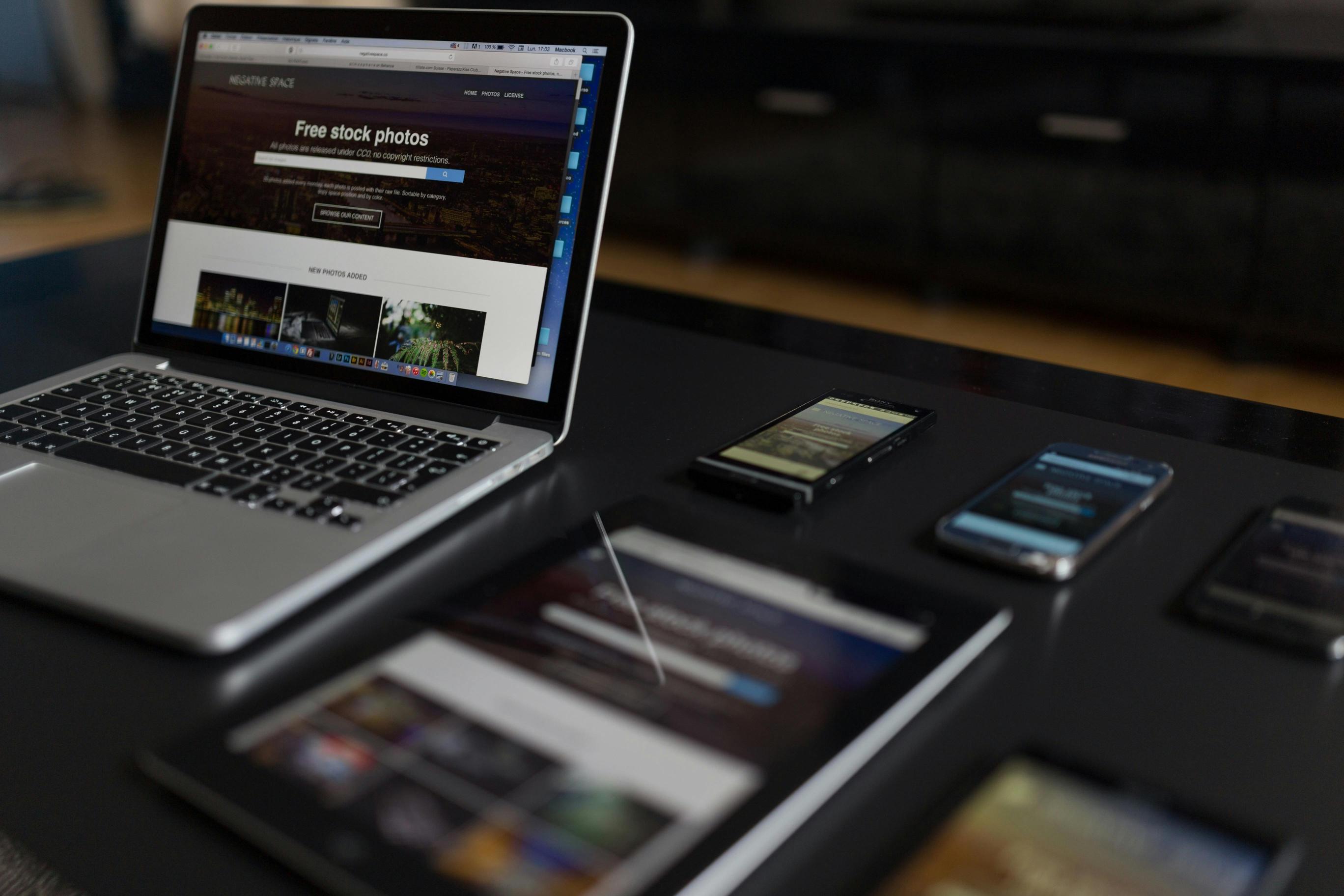
### Implementing Responsive and Adaptive DesignIn the fast-paced world of user interface design, two fundamental principles are integral to delivering a seamless user experience: responsive and adaptive design. These methodologies ensure that applications and websites perform optimally across a plethora of devices, from the mammoth desktop monitors to the palm-sized smartphones.
Here’s an exploration into the best practices for UI design when implementing these strategies. Responsive design is all about fluidity and flexibility. It employs a dynamic grid layout, flexible images, and CSS media queries to create a visual experience that effortlessly adapts to different screen sizes and orientations.
Think of it like water—it assumes the shape of its container. As the user shifts from their laptop to their tablet, the content reflows to accommodate the varying display dimensions.
For instance, a three-column layout on a desktop might reshape itself into a single column on a smartphone, thereby maintaining readability and functionality without demanding extra laborious swipes and zooms from the user. Adaptive design, on the other hand, feels more like a smart chameleon. It doesn’t just stretch or squeeze content to fit into the screen; it detects the device and loads an appropriate predefined layout.
Large buttons that are ideal for touchscreen interaction on mobile devices, tooltip-enriched navigation for desktop cursor precision, or optimized image resolutions for the high-end retina displays, adaptive design serves up the version of the site that’s tailor-made to the user’s current apparatus. The method does require more initial development work, as it involves designing multiple layouts but can result in a more nuanced user experience.
Employing a combination of responsive and adaptive design principles forms the bedrock for creating robust UI that’s not just aesthetically pleasing but also highly functional and user-centric. The underlying goal remains unchanged: to deliver content in the most accessible, logical, and enjoyable way possible, irrespective of device constraints. Mastering these practices is not merely following a trend, but investing in a design that stands resilient amid the ever-evolving landscape of devices and screen sizes.
As best practices come and go, the commitment to a flexible and understanding UI will ensure that users always find harmony, not havoc, in their digital interactions.
The role of color and typography in ui design
## The Role of Color and Typography in UI DesignWhen it comes to the art of UI design, few elements have as much sway as color and typography. These components are the silent ambassadors of brand identity; they convey a multitude of messages and emotions even before a user interacts with a product.
Understanding the psychology of color in UI design allows creators to elicit specific responses and direct user attention effectively. For instance, the color blue can evoke trust and security, commonly used by banks and social media platforms, while green is often associated with growth and harmony, a favorite for eco-friendly brands. Typography, on the other hand, is the unspoken voice of written content—its style, weight, and spacing all play pivotal roles in readability and user engagement.
Opting for a sans-serif font like Helvetica can communicate modernity and simplicity, making it a ubiquitous choice for tech startups. On the flip side, a serif font like Times New Roman might evoke a sense of formality and respectability, often seen in traditional academic or legal institutions. Best practices for UI design call for a harmonious blend of both elements; a well-balanced color scheme that complements the brand persona, along with typography that enhances readability and user experience.
Consider Slack’s interface, which uses a palette of friendly, approachable colors alongside clear, concise fonts that enable easy navigation and communication. In contrast, Adobe software interfaces often employ a darker color theme with crisp, professional typography that subconsciously aligns with the creative professionalism of its user base.
Ultimately, the command of color and typography in UI design is not merely about aesthetic appeal; it’s about crafting a visual hierarchy that guides users intuitively through a digital product. It’s about creating a visual that speaks to users, reassuring them with familiarity and surprising them with moments of delightful nuance.
As designers continue to play with these fundamental tools of expression, the possibilities for innovative and user-friendly interfaces are as rich and vibrant as the palette at their fingertips.
Continuous testing and iteration for ui improvement
### Continuous Testing and Iteration for UI ImprovementCreating an exceptional user interface (UI) is akin to fine-tuning a masterful symphony—both require relentless practice, testing, and a commitment to perpetual improvement. For designers and developers, this dedication manifests in the form of continuous testing and iteration, which are pivotal best practices for UI design.
This methodology doesn’t simply aim for a functional aesthetic; its goal is the zenith of usability and user satisfaction. The process begins with an understanding that the first draft of a UI is rarely, if ever, its final form. Here, we venture into the iterative cycle, employing a variety of testing methods—from A/B testing to usability studies—to garner feedback that is as diverse as the user base.
This data becomes the guiding light for refinements. For instance, A/B testing can reveal user preferences for a button’s color or placement that could significantly enhance their interaction, leading to increased engagement or conversions. The insight drawn from real user interactions provides concrete evidence of what works and what doesn’t, rather than relying solely on intuition or trends.
But it’s not just about isolated elements; continuous testing and iteration address the UI as a cohesive ecosystem. Take, for example, the navigation menu.
Through iterative testing, hidden friction points can be uncovered, like a menu that confuses users or slows down their journey. Iteration allows for these kinds of issues to be promptly addressed—perhaps through menu simplification or a more intuitive layout.
Only by continuously revisiting and revising these elements can a UI designer ensure the interface evolves alongside users’ needs and technological advancements. As the UI improves, so does the user’s journey—from their initial encounter to the ultimate destination within the application or website. Embracing continuous testing and iteration in UI design is not an admission of previous inadequacy but rather an acknowledgment of the dynamic nature of user needs and preferences.
The best UI designs are not monuments but living canvases, adapting to both the subtle and seismic shifts in the digital landscape. Just as a seasoned gardener tends to their blooms with daily care, so too must designers nurture their interfaces—with the tools of testing and iteration—to ensure they grow to their full potential, blossoming into experiences that delight and serve users with every interaction.
Nasza rekomendacja video
To sum up
In conclusion, effective UI design is crucial for user engagement and satisfaction. Best practices include maintaining simplicity, ensuring consistency, prioritizing navigation, being responsive across devices, and providing clear feedback to users.
By focusing on these core principles, designers can create intuitive and aesthetically pleasing interfaces that enhance the overall user experience.
FAQ
What are the fundamental principles of effective UI design that ensure a user-friendly experience?
The fundamental principles of effective UI design that ensure a user-friendly experience include clarity, which ensures that the interface is understandable and unambiguous; consistency, which helps users become familiar with the UI and predict how it will behave; and simplicity, which focuses on presenting only the necessary elements to reduce cognitive load. Additionally, feedback, which informs users about the results of their actions, and efficiency, which streamlines user tasks to enhance productivity, are key to a positive user experience.
How can UI designers balance aesthetics with functionality to create an intuitive interface?
UI designers can balance aesthetics with functionality by adhering to user-centered design principles, ensuring that visual elements enhance usability rather than detract from it. They should prioritize clear visual hierarchies, consistent design patterns, and intuitive navigation to guide users effortlessly through the interface. By conducting user testing and gathering feedback, designers can fine-tune the balance between a visually appealing interface and one that offers a seamless and intuitive user experience.
In what ways can UI design be optimized for accessibility to accommodate users with disabilities?
UI design can be optimized for accessibility by implementing features such as high-contrast color schemes for users with visual impairments, providing alternative text for images for screen reader users, and ensuring that all interactive elements are navigable via keyboard for those who cannot use a mouse. Additionally, providing captions or transcripts for audio and video content can accommodate users who are deaf or hard of hearing. These measures help create an inclusive experience by addressing various accessibility needs.
What role does user research play in shaping UI design decisions, and how can it be effectively integrated into the design process?
User research plays a critical role in shaping UI design decisions by providing insights into user needs, behaviors, and preferences, ensuring that the design is user-centered and tailored to provide a seamless and effective user experience. To effectively integrate user research into the design process, it should be conducted early and throughout the design stages, using a variety of methods such as surveys, interviews, usability testing, and analytics to inform and validate design choices, and to iterate on the design based on user feedback and data.
How can UI designers stay up-to-date with the latest design trends without compromising on usability?
UI designers can stay current with design trends while maintaining usability by regularly reviewing industry blogs, attending design conferences, and participating in online communities, all while rigorously testing new design patterns for user-friendliness before implementation. They should also balance trend adoption with a strong focus on core usability principles, ensuring that any new design elements enhance rather than detract from the user experience.
What are some common UI design mistakes that can negatively impact user engagement, and how can they be avoided?
Common UI design mistakes that can negatively impact user engagement include cluttered layouts that overwhelm users, inconsistent design elements that create confusion, and non-intuitive navigation that hinders user flow. To avoid these pitfalls, designers should focus on simplicity, maintain a coherent visual language throughout the application, and prioritize intuitive navigation pathways that align with user expectations and behaviors. Regular user testing can also help identify and rectify these issues before they affect user engagement.

